Crew Genius:
Workforce Management, Crew-First
Workforce Software Forgot the Workforce
Retail and hospitality run on people. A coffee shop opens because someone shows up at 5am to start the espresso machine. A boutique hotel earns a five-star review because the front desk knew the guest's name. The crew is the product. And yet the software built for managing them treats them like rows in a spreadsheet — shifts to fill, hours to track, costs to minimize.
Every existing workforce tool optimizes for the same thing: operational efficiency for the manager. Schedule faster. Cover more shifts. Cut more cost. The team member experience is an afterthought — a mobile app bolted on so workers can see when they're working and request time off through a clunky form. The manager gets a dashboard. The crew gets a notification.
The idea behind Crew Genius was to flip the priority. Build a workforce management platform where the crew member experience matters as much as operational efficiency — where knowing "who" comes before scheduling "where" — and where the language, the visual tone, and the information architecture all reflect a simple belief: take care of your crew, and your crew will take care of your customers.
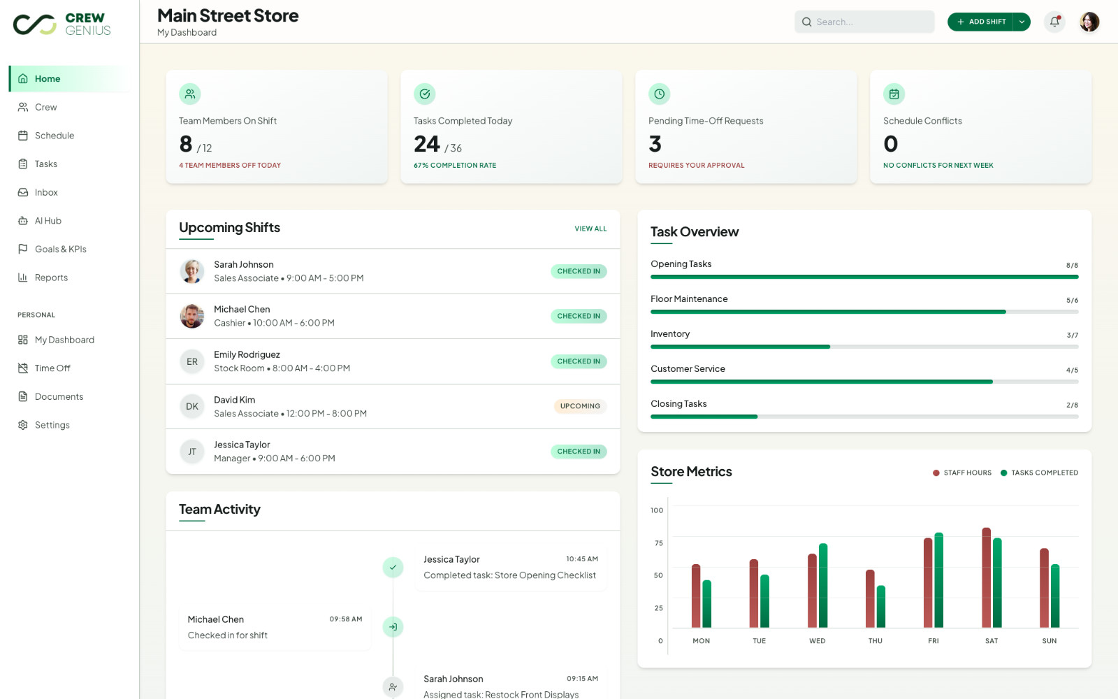
The dashboard sets the tone — a personal greeting, pending requests called out by name, and quick actions that read like verbs a manager would actually use: create shift, assign task, send message.
Design-First, Driven by Preparation
Most SaaS products start with a backend and add a UI on top. Crew Genius started the other way around. Before any code was written, the project produced a complete foundation: a stylescape and moodboard defining the warm, hospitality- forward visual tone; user personas mapping out managers, crew leads, and frontline workers; a full information architecture for thirty-plus screens; and a data model that the screens were designed against.
That preparation paid off in the design phase. The original workflow ran every screen through v0 first, then Stitch, then token extraction, then Next.js. After the first few screens it became clear that with the moodboard and the detailed screen prompts already in hand, Stitch alone was producing better results than the multi-tool chain. The workflow pivoted mid-stream to Stitch-direct — feeding Stitch the moodboard and a structured screen prompt and getting design-ready variants back in a single pass.
Three dashboard variants were generated to explore direction. Variant 2 had stronger structural completeness; Variant 3 had a warmer, more personality-driven aesthetic that aligned with the crew-first philosophy. Variant 3 was chosen as the anchor — and every subsequent screen, from the crew list to the schedule to the person detail page, inherits its design system: light sidebar, teal-green primary, soft rounded cards, friendly typography.
Stitch-Direct Design Workflow
Moodboard + Prompt → Anchor → PropagationThree steps, repeatable across the product. The anchor defines the system. The system propagates. Every screen feels like part of the same product because the design tokens are extracted, not re-invented.
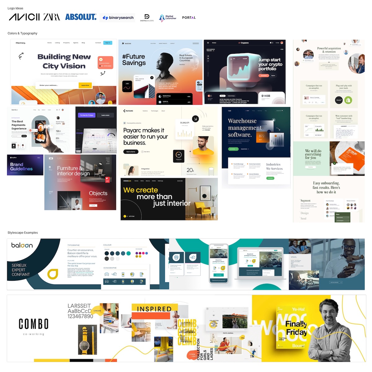
The stylescape established the aesthetic direction before a single screen was designed — warm hospitality over clinical efficiency, organic shapes over harsh grids, teal-green primary over corporate blue.
Information Architecture as Product Strategy
The crew-first philosophy showed up most clearly in two structural decisions that shaped the entire product. The first was consolidating crew member information into a single person detail page with six tabs — Schedule, Availability, Tasks, Activity, Documents, Details — rather than scattering it across separate pages. The team member is the unit of organization. Everything about a person lives in one place.
The second was reordering the workforce section so it follows the manager's actual mental model. The flow runs: team rosters first, then availability, then coverage gaps, then operational progress. The manager knows "who" before scheduling "where." Most workforce tools lead with the schedule grid because that's the legacy mental model. Crew Genius leads with people because that's the actual job.
Underneath this sits a shared Next.js template architecture used across a family of SaaS products. Auth, navigation shell, settings, billing scaffolding, and the design system primitives are all inherited from the template. Crew Genius brings the domain — the data model, the workforce-specific screens, the crew-first IA — and composes it on top. New products in the family start with the same foundation and the same design discipline.
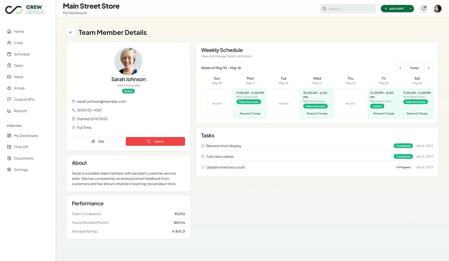
The consolidated person detail page — six tabs in one view. The manager opens a crew member once and sees everything about them. No tab-switching across pages, no losing context.
People before places
The navigation leads with the team — roster, availability, coverage gaps — before getting to schedules and shifts. Managers know who they have before they decide where to put them.
Shared template architecture
Built on a reusable Next.js template that handles auth, navigation, settings, and design system primitives — enabling consistency across a family of SaaS products without rebuilding the foundation each time.
A Complete Crew-First Product
Crew Genius shipped as a connected product, not a thin prototype. The marketing site — home, features, how it works, pricing, contact, signup — sets the tone with a warm hospitality-forward aesthetic that flows directly into the app. Clicking "Get Started" doesn't feel like crossing into a different product. Same family, different room.
Inside the app, managers move through a connected set of screens built around the crew-first IA. The dashboard surfaces what needs attention today. The crew section leads with people. The schedule supports coverage planning once the team is in place. The person detail page brings everything about a single team member into one tabbed view. Inbox, tasks, reports, and settings round out the workspace — all sharing the same design tokens, the same sidebar navigation, the same warm tone.
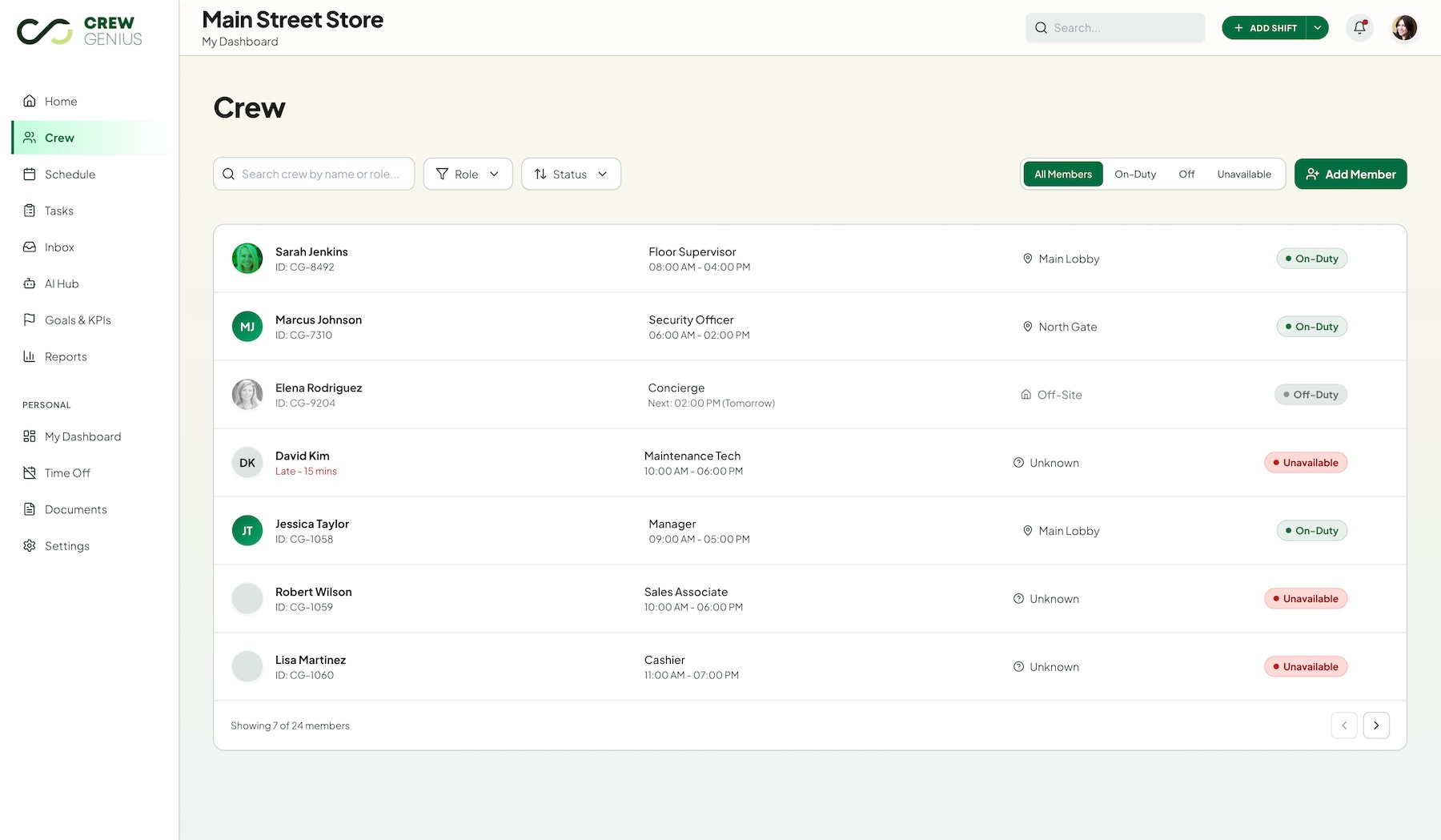
The crew list — team members first, sorted by role and availability. The starting point for every scheduling and assignment decision.
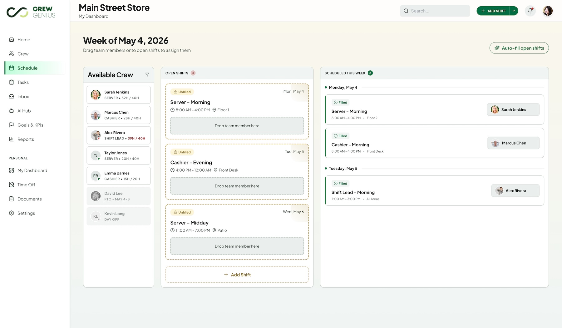
The schedule — coverage planning grounded in who's already on the team. Shift creation pulls from the crew roster, not a generic worker pool.
What Shipped
A warm, crew-first workforce platform — marketing site, full app, unified design system, and a shared Next.js template foundation that's ready to power the next product in the family.